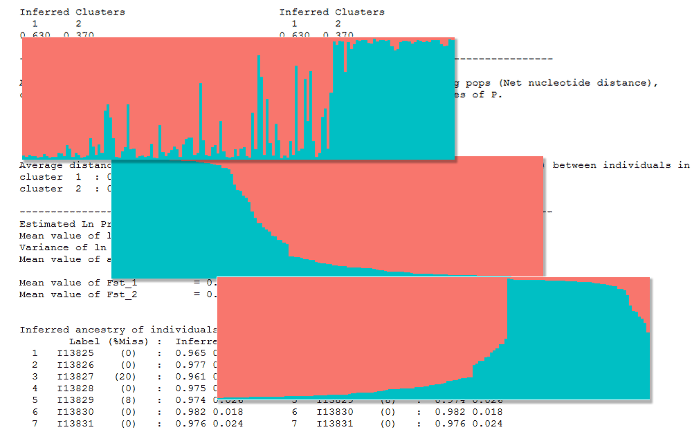
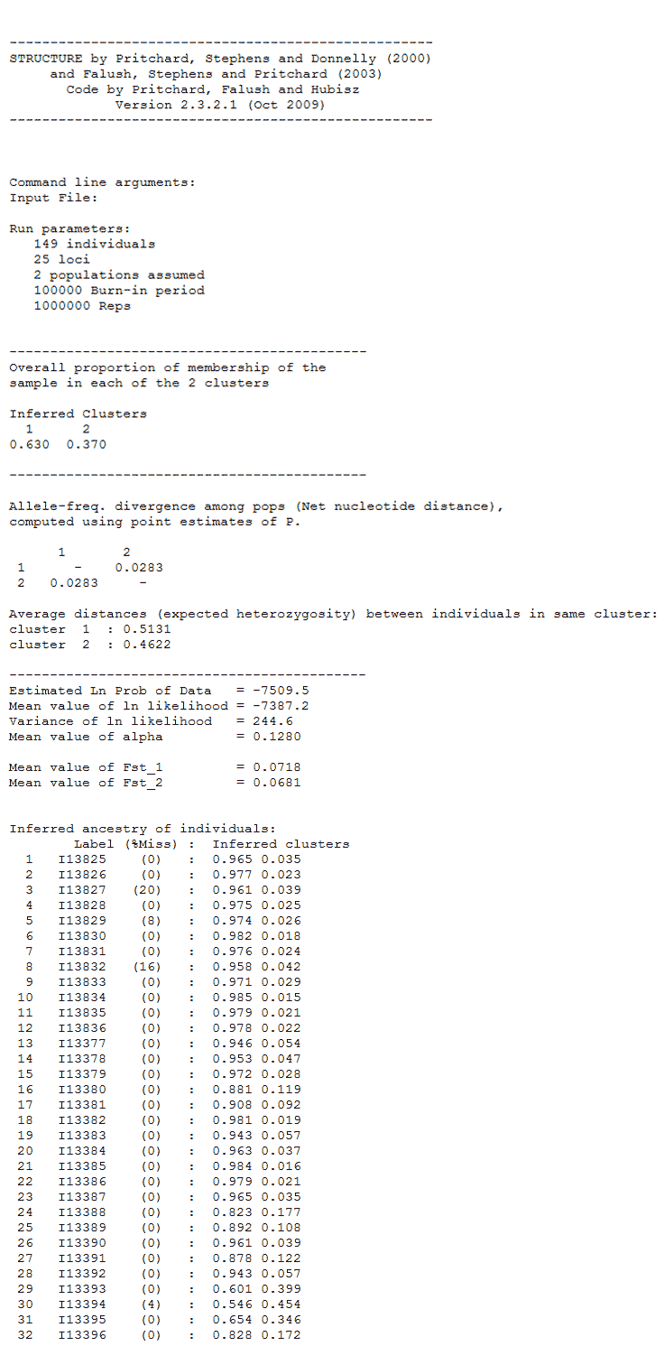
I currently use STRUCTURE 2.3.4 on Windows. A typical assignment output file for K=2 looks like below. Here is the structure file I use.
We can use the plotting functionality within STRUCTURE to view the assignment results as a barplot. See fig below. The individuals are ordered in the same order as the input file when selecting the ‘Original order’ option. There is another option to sort individuals called ‘Sort by Q’. What does this actually do?
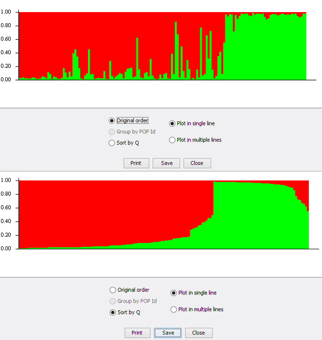
One might reasonably assume that the individuals are sorted by one of the assignment clusters. But, that is not the case. We will try to plot the data manually and investigate this option. The structure output file used can be downloaded here. This is the same as that linked earlier.
We use the R package pophelper to convert structure files to R dataframe, ggplot package for plotting and reshape2 package for data restructuring. The data is read into R as a dataframe with two columns Cluster1 and Cluster2 with assignment values.
#install pophelper library
#library(devtools)
#install_github('royfrancis/pophelper')

#load packages
library(ggplot2)
library(reshape2)
library(pophelper)

#read data to dataframe
df <- readQ("structure-file.txt")[[1]]
head(df)


> head(df)
Cluster1 Cluster2
1 0.965 0.035
2 0.977 0.023
3 0.961 0.039
4 0.975 0.025
5 0.974 0.026
6 0.982 0.018
Now we create a function to create the plot.
#create function to generate plots
plotfn <- function(df=NULL, filename=NULL){
#reshape to long format
df$num <- 1:nrow(df)
df1 <- reshape2::melt(df, id.vars="num")
#reversing order for cosmetic reasons
df1 <- df1[rev(1:nrow(df1)), ]

#plot
p <- ggplot(df1, aes(x=num, y=value, fill=variable))+
geom_bar(stat="identity", position="fill", width=1, space=0)+
scale_x_continuous(expand = c(0, 0))+
scale_y_continuous(expand = c(0, 0))+
labs(x = NULL, y = NULL)+
theme_grey(base_size=7)+
theme(legend.position = "none",
axis.ticks = element_blank(),
axis.text.x = element_blank())

ggsave(filename=filename, plot=p, height=4, width=12, dpi=150, units="cm")
}

#plot unsorted plot
plotfn(df=df, filename="bp-r-unsorted.png")
Here is the assignment barplot in the original order.
Now we create two plots. One figure where the table is sorted by Cluster1 and second figure where the table is sorted by Cluster2.
#sort table by cluster1
df_c1 <- df[order(df[, 1]), ]
plotfn(df=df_c1, filename="bp-r-sortedc1.png")

#sort table by cluster2
df_c2 <- df[order(df[, 2]), ]
plotfn(df=df_c2, filename="bp-r-sortedc2.png")


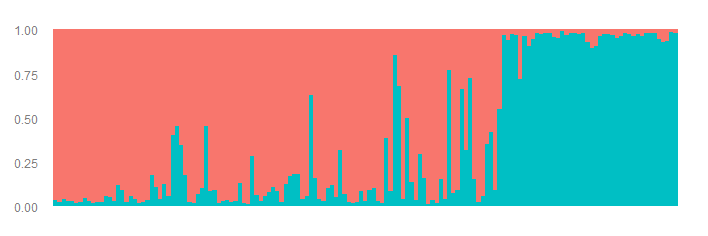
Both of these plots do not resemble the ‘Sort by Q’ option in Structure software. They look like mirror images only because it’s K=2. For K>2, they would look quite different. Anyway, the ‘Sort by Q’ option does a bit more. For each individual, the max assignment value is picked to create a new column called ‘max’. The cluster number with the max assignment is created as a new column called ‘match’. The the whole table is sorted ascending by ‘match’ and descending by ‘max’. Here is the R code.
#pick max cluster, match max to cluster
maxval <- apply(df, 1, max)
matchval <- vector(length=nrow(df))
for(j in 1:nrow(df)) matchval[j] <- match(maxval[j], df[j, ])

#add max and match to df
df_q <- df
df_q$maxval <- maxval
df_q$matchval <- matchval

#order dataframe ascending match and decending max
df_q <- df_q[with(df_q,  order(matchval, -maxval)), ]

#remove max and match
df_q$maxval <- NULL
df_q$matchval <- NULL

#plot
plotfn(df=df_q, filename="bp-r-sortedq.png")
And that gives us the plot we are looking for. The same plot created in the STRUCTURE software.

Here is also an Excel file with the calculations, if R is not your thing.
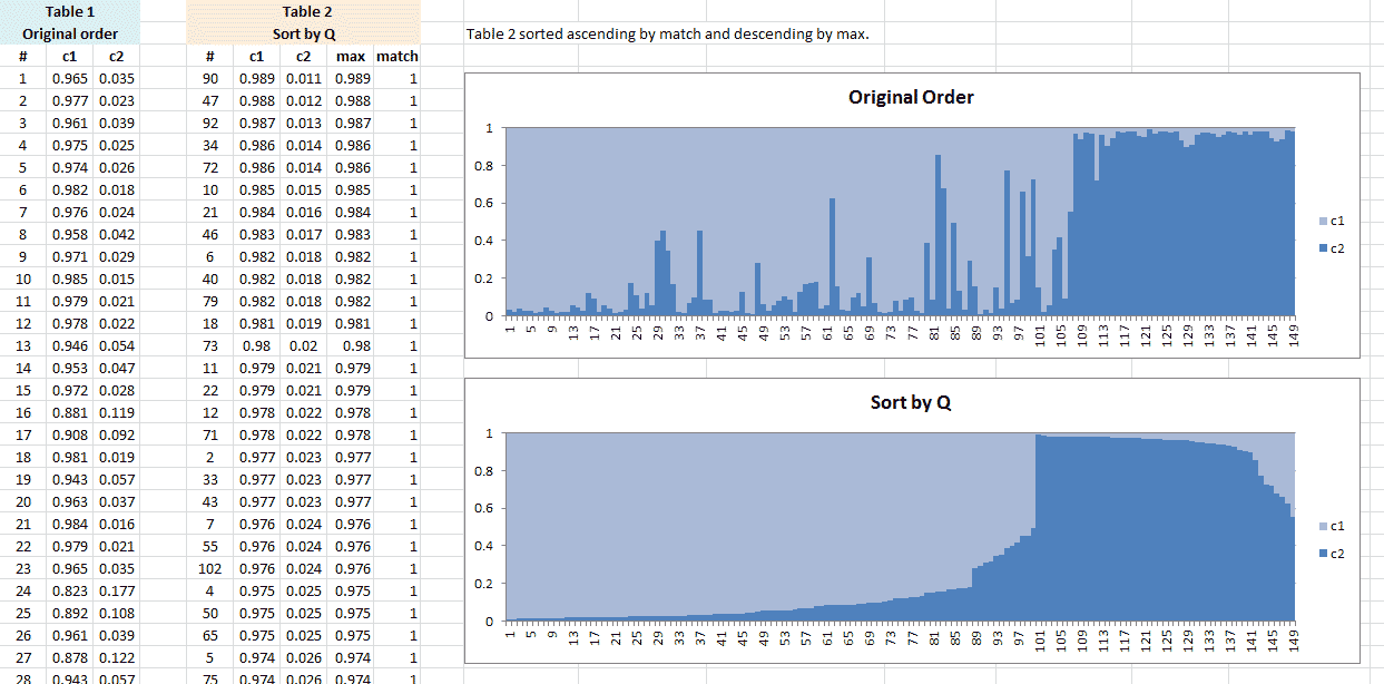
You can always verify by checking the individual number (#) with the individual numbers in the STRUCTURE software (set to ‘Plot in multiple lines’).
That’s all for now. I hope this was useful for all those who were as confused as I was.


Comments