Circos plots are popular for displaying huge amounts of data in a relatively small visual space. This is especially relevant for genomic data. This post explores creating Circos-style genomic data plots in R using R package circlize.
The first step is plan your figure. How many genomes to include? Or perhaps, it’s one genome with multiple chromosomes. What sort of information do you want to include? In my case, I have three bacterial genomes for which I would like to show the sequencing depth, GC content, locations of important genes and finally rearrangements between the three genomes. You need to have all this data prepared first. Unfortunately I am unable to provide the raw files, but I can give an idea of the file formats.
Data
My three genomes are named pb_501_001, pb_501_002 and pb_501_003.
Coverage was computed on BAM files using bedtools genomecov. The data looked like this:
pb_501_001 1 24
pb_501_001 2 58
pb_501_001 3 62
...
with columns: sample, base and depth. This was read into R and converted to median coverage within a window size of 1000 bases creating a BED format. This is file named cov later in the code.
chr        start end  value1
pb_501_001 1     1000 145
pb_501_001 1001  2000 154
pb_501_001 2001  3000 158
...
The GC content was computed using bedtools nuc. The data is a typical BED format when read into R looks like below. This is the file named gc later in the code.
chr        start end  value1
pb_501_001 1     1000 145.0
pb_501_001 1001  2000 154.0
pb_501_001 2001  3000 158.0
...
The gene annotation file looks like below. This file is called ann later in the code.
chr        start  end    value1 gene
pb_501_001 325210 326376 1      yxeP
pb_501_001 397301 397795 1      sorB
pb_501_001 399088 400035 1      sorC
...
The value1 is a random value (to maintain bed format, the actual value is not used).
The rearrangements can be obtained from Mauve or Nucmer (Mummer). The data is for pairs of genomes/chromosomes and it looks like:
pb_501_001 1     59986   pb_501_002 1       62503
pb_501_001 60196 1183032 pb_501_002 4682296 3560259
...
with columns: name of genome/chr 1, start position in 1, end position in 1, name of genome/chr 2, start position in 2, end position in 2.
This is split up into two files which I call nuc1 and nuc2 later in the code.
nuc1
pb_501_001 1       59986
pb_501_001 60196   1183032
pb_501_001 1182899 4708778
...
nuc2
pb_501_002 1       62503
pb_501_002 4682296 3560259
pb_501_002 67566   3555254
...
Plotting
We are now ready to start plotting. We will first look at the default code for each step and then also explore the customised code . Plots are showed side by side to compare default and customised results.
Start by loading the library and initialising the layout.
library(circlize)
circos.clear()
circos.initialize(factors=c("pb_501_001", "pb_501_002", "pb_501_003"),
xlim=matrix(c(rep(0, 3), ref$V2), ncol=2))
The xlim matrix defines the start and stop for each genome/chr. Essentially the genome or chr sizes. The matrix looks like this:
> matrix(c(rep(0, 3), ref$V2), ncol=2)
        [,1] [,2]
[1,] 0    5167156
[2,] 0    5138029
[3,] 0    5080212
Genome
At this point, the plotting window is still blank because nothing as actually been drawn. Then we create the genome backbone.
# genomes
circos.track(ylim=c(0, 1), panel.fun=function(x, y) {
chr=CELL_META$sector.index
xlim=CELL_META$xlim
ylim=CELL_META$ylim
circos.text(mean(xlim), mean(ylim), chr)
})
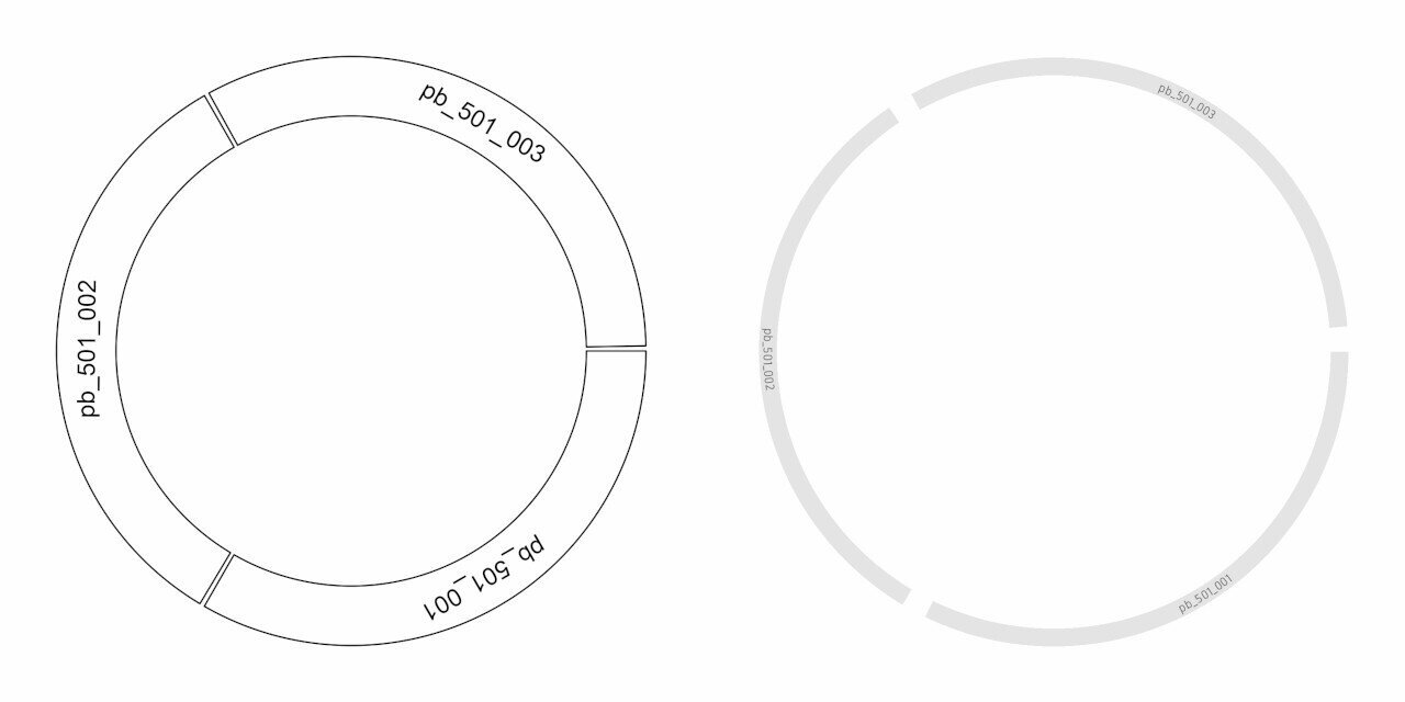
Now, we can see the plot showing the three genomes and their relative lengths. They are labelled using the circos.text() command. We can customise this by first setting some custom defaults using circos.par(). gap.degree is increased to increase gap width so as to fit in our y-axis labels later. cell.padding is set to zero to reduce empty space around the plots. Then, we resize the panel height, adjust text size and background colour.
circos.clear()
col_text <- "grey40"
circos.par("track.height"=0.8, gap.degree=5, cell.padding=c(0, 0, 0, 0))
circos.initialize(factors=ref$V1, xlim=matrix(c(rep(0, 3), ref$V2), ncol=2))

# genomes
circos.track(ylim=c(0, 1), panel.fun=function(x, y) {
chr=CELL_META$sector.index
xlim=CELL_META$xlim
ylim=CELL_META$ylim
circos.text(mean(xlim), mean(ylim), chr, cex=0.5, col=col_text,
facing="bending.inside", niceFacing=TRUE)
}, bg.col="grey90", bg.border=F, track.height=0.06)
Now we can compare how our raw and custom plots look like.
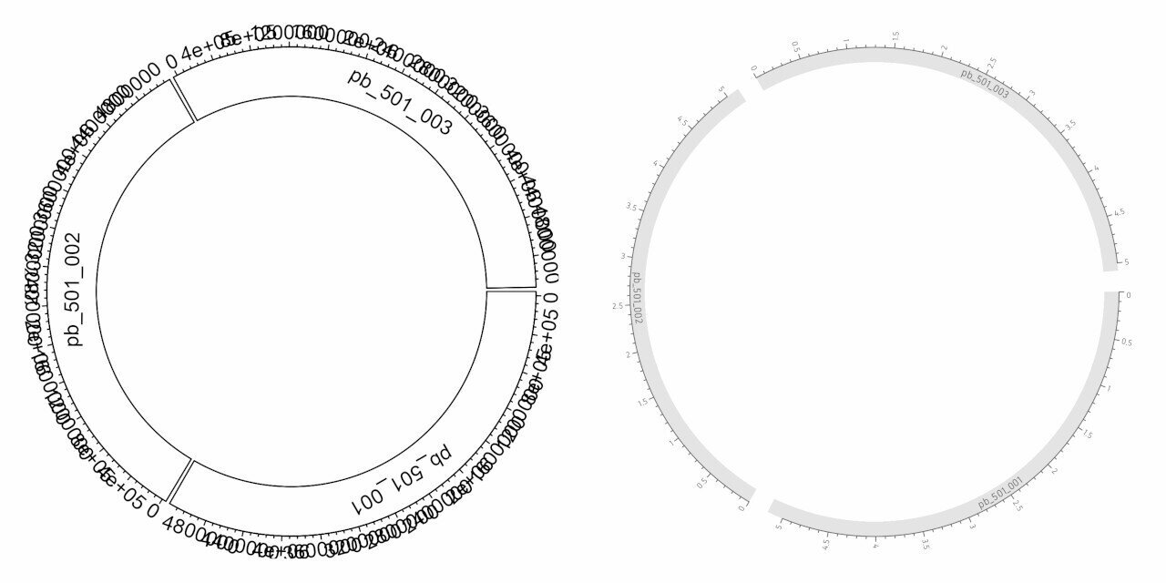
Let’s add an x-axis to the plot:
# genomes x axis
circos.track(track.index = get.current.track.index(), panel.fun = function(x, y) {
circos.axis(h="top")
})
We can see the x-axis added (see below). We are going to add custom breaks, change label colour, size, direction and thickness of the axis line.
# genomes x axis
brk <- c(0, 0.5, 1, 1.5, 2, 2.5, 3, 3.5, 4, 4.5, 5)*10^6
circos.track(track.index = get.current.track.index(), panel.fun=function(x, y) {
circos.axis(h="top", major.at=brk, labels=round(brk/10^6, 1), labels.cex=0.4,
col=col_text, labels.col=col_text, lwd=0.7, labels.facing="clockwise")
}, bg.border=F)
Coverage
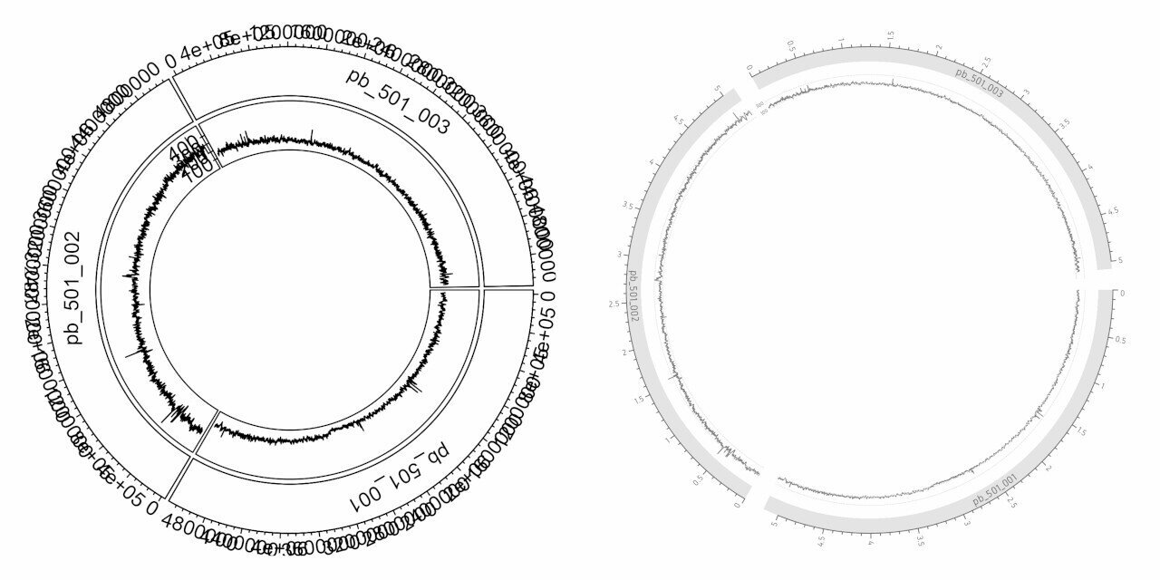
Let’s add the coverage information and a y-axis for the coverage:
# coverage
circos.genomicTrack(data=cov, panel.fun=function(region, value, ...) {
circos.genomicLines(region, value)
})
# coverage y axis
circos.yaxis()
The coverage along the genome is displayed as a line. The y-axis is used to show a reference for the values that are plotted. We will change properties of the line such as colour and thickness. We add extra segments to act as gridlines. And we remove all y-axis elements except the text.
# coverage
circos.genomicTrack(data=cov, panel.fun=function(region, value, ...) {
circos.genomicLines(region, value, type="l", col="grey50", lwd=0.6)
circos.segments(x0=0, x1=max(ref$V2), y0=100, y1=100, lwd=0.6, lty="11", col="grey90")
circos.segments(x0=0, x1=max(ref$V2), y0=300, y1=300, lwd=0.6, lty="11", col="grey90")
#circos.segments(x0=0, x1=max(ref$V2), y0=500, y1=500, lwd=0.6, lty="11", col="grey90")
}, track.height=0.08, bg.border=F)
circos.yaxis(at=c(100, 300), labels.cex=0.25, lwd=0, tick.length=0, labels.col=col_text, col="#FFFFFF")
GC content
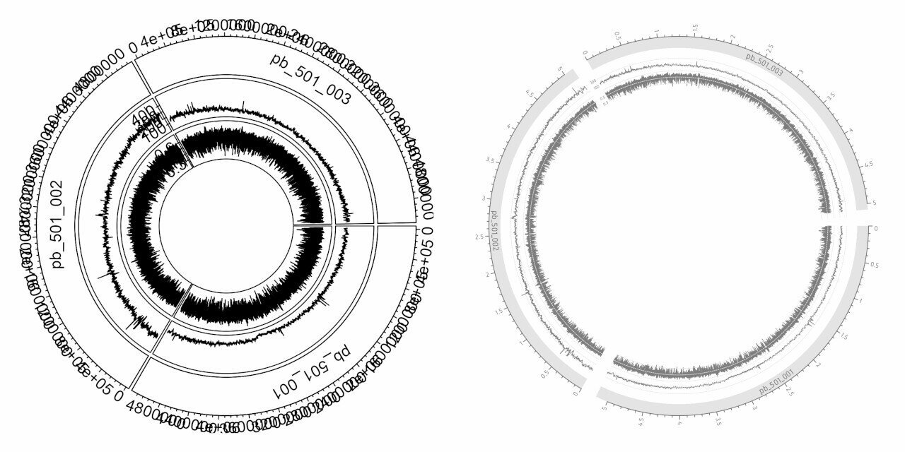
Let’s add GC content and it’s y-axis:
# gc content
circos.track(factors=gc$chr, x=gc$x, y=gc$value, panel.fun=function(x, y) {
circos.lines(x, y)
})
# gc y axis
circos.yaxis()
Similar to the previous step, GC content is displayed as lines. The customisation is similar to the previous step. The gridline positions and values have obviously changed.
# gc content
circos.track(factors=gc$chr, x=gc$x, y=gc$value, panel.fun=function(x, y) {
circos.lines(x, y, col="grey50", lwd=0.6)
circos.segments(x0=0, x1=max(ref$V2), y0=0.3, y1=0.3, lwd=0.6, lty="11", col="grey90")
circos.segments(x0=0, x1=max(ref$V2), y0=0.5, y1=0.5, lwd=0.6, lty="11", col="grey90")
circos.segments(x0=0, x1=max(ref$V2), y0=0.7, y1=0.7, lwd=0.6, lty="11", col="grey90")
}, ylim=range(gc$value), track.height=0.08, bg.border=F)
# gc y axis
circos.yaxis(at=c(0.3, 0.5, 0.7), labels.cex=0.25, lwd=0, tick.length=0, labels.col=col_text, col="#FFFFFF")
Gene labels
Then we add gene labels:
# gene labels
circos.genomicLabels(ann, labels.column=5)
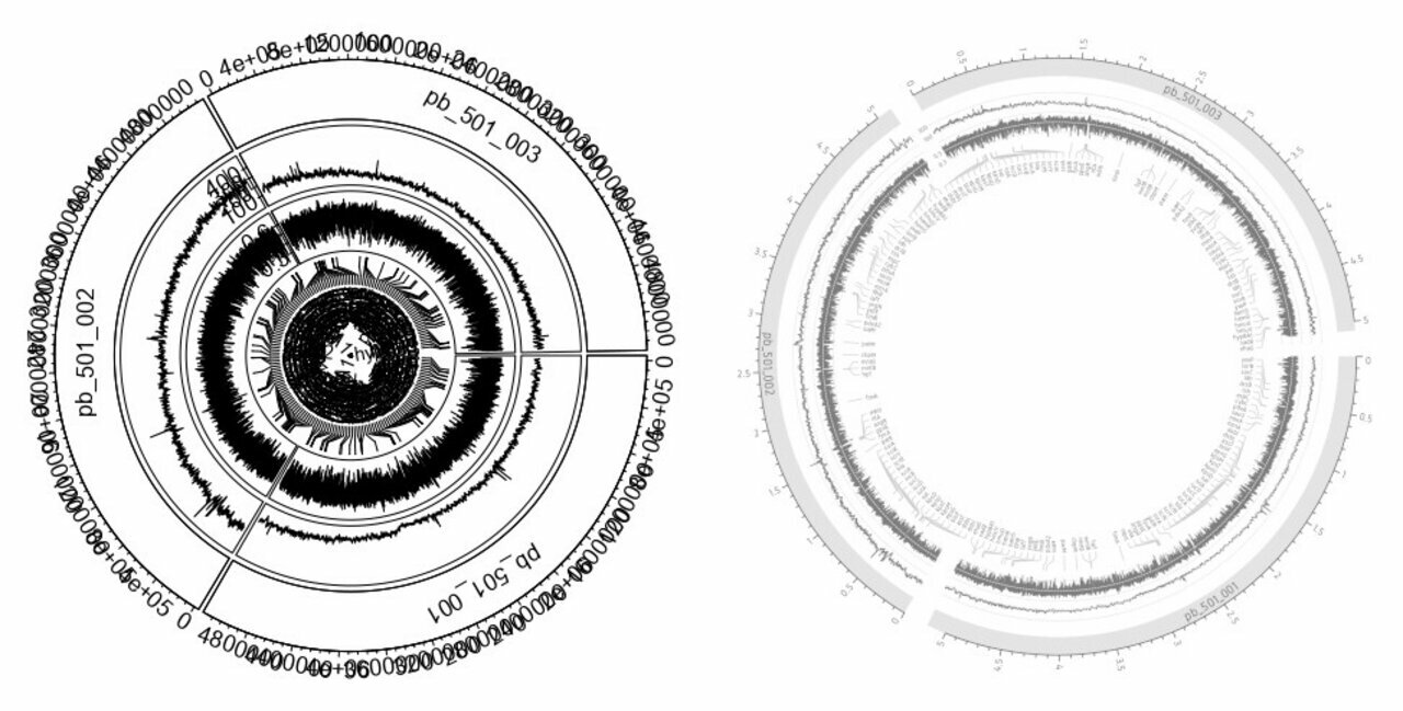
The gene labels are added along with connection lines to indicate their exact position in the genome. This is too crowded without some manual customisation. We adjust the label size, colour and the length, thickness and colour of the connection lines. The track height is set to a custom value.
# gene labels
circos.genomicLabels(ann, labels.column=5, cex=0.25, col=col_text, line_lwd=0.5, line_col="grey80",
side="inside", connection_height=0.05, labels_height=0.04)
Rearrangements
Finally, we add the rearrangements using circos.genomicLink() function.
# rearrangements
circos.genomicLink(nuc1, nuc2)
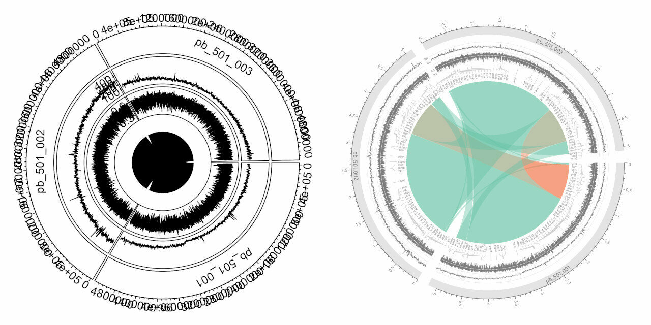
If you are running these steps interactively, this may not be visible as there is no space. But, if you run this inside a png() device, you can at least see it. Since there is no transparency, overlapping ribbons are not visible. We will assign green colour to rearrangements in the same direction and red colour to inversions. And we set 0.4 opacity for better visibility of overlapping ribbons.
# rearrangements
rcols <- scales::alpha(ifelse(sign(nuc1$start - nuc1$end) != sign(nuc2$start - nuc2$end), "#f46d43", "#66c2a5"), alpha=0.4)
circos.genomicLink(nuc1, nuc2, col=rcols, border=NA)
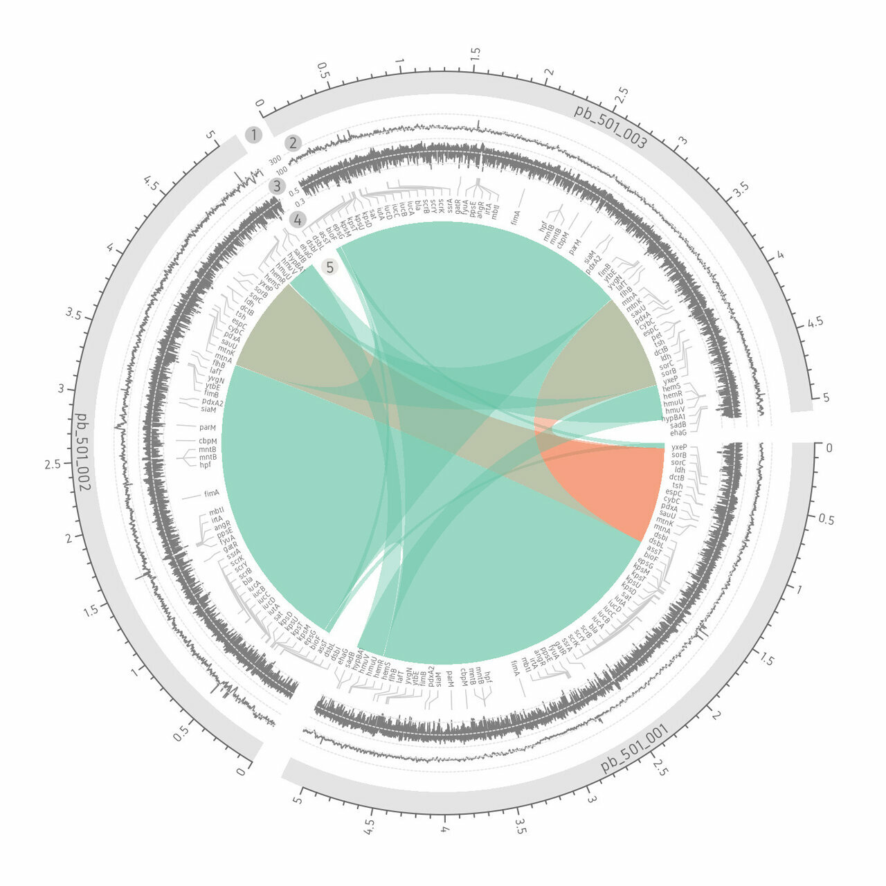
And here we have the complete plot. Track heights for every track has been reduced to leave space for the rearrangement link figure in the middle.
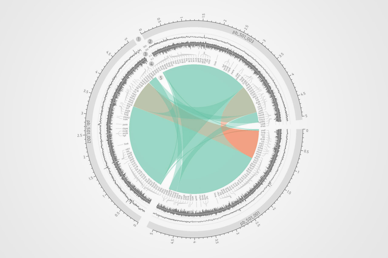
For the purpose of captioning, I have further added some numbers in an image editing software. This will be useful to describe each part of the figure.



Comments